Twenty Fifteen Theme Questions And Recommendations
-
Hello,
I have some questions and recommendations for the new Twenty Fifteen.
1. Are there any plans on adding Hover Text (text that shows when you hover the mouse cursor over something) for the Menu Button that will show what that button/symbol/icon represents so that people who do not recognize that symbol/button/icon will know what it represents?
If not, I would like to recommend that hover text be added for that, because not everyone recognizes or knows what every button/symbol/icon represents and some people prefer to have labels to show what they represent, and I think that developers should always show things like that/this when possible.
2. Are there any plans on adding Timestamps for posts as hover text when you put the mouse cursor over the date so that people will know the exact time that a post was created?
If not, I would like to recommend that hover text for timestamps for posts be added, because some of us like to know not only the date but what time a post/page was created.
3. The font in the New Editor is smaller than the actual font for Twenty Fifteen, are there any plans on increasing the font size to match the actual font for Twenty Fifteen?
If not, I would like to recommend that the font in the New Editor is increased to match the font size for Twenty Fifteen, because it is a bit too small in my opinion in the New Editor but it looks fine in the Classic Editor.
4. The Tagline shows in Desktop and Tablet Sizes, but not in Mobile Sizes in the Customizer; are there any plans on having the Tagline show in Mobile Sizes as well?
If not, I would like to recommend that the Tagline is shown in all sizes because some of us want our Tagline to always be visible.
5. The Recent Comments widget has a problem where a border shows on the widget making it look strange, are there any plans on fixing this?
https://mediacru.sh/vx9GgyrdP8Ld
If not, I would like to recommend that this is fixed to improve the appearance of this widget.
6. The Social Links Menu has a problem where the generic Share Genericon (http://genericons.com/#share) is not showing for social links that do not have a custom Genericon and it shows a crossed out circle instead; are there any plans on fixing this by adding the generic Share Genericon and/or another Genericon for social links that do not have a custom Genericon?
https://mediacru.sh/5ZGcHqakGCh-
If not, I would like to recommend that this is done to improve the appearance of social links that do not have a custom Genericon.
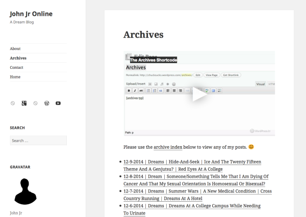
7. The spacing of WordPress.tv videos (added by using the copy shortcode for WordPress.com option directly from each video) is incorrect for me, instead of being double spaced they are triple or quadruple spaced it seems (but I could be wrong), I do not see this problem with YouTube videos; are there any plans on fixing this?
https://mediacru.sh/Qc31AC_ooBoi
You can see this on my About page (http://johnjronline.wordpress.com/about/), Archives page (http://johnjronline.wordpress.com/archives/), and Contact page (http://johnjronline.wordpress.com/contact/).
These are my current questions/recommendations after only glancing at the theme briefly, but I may/might have more questions/recommendations later as I have more time with the theme and I will post them here.
Thank you,
-John Jr
The blog I need help with is: (visible only to logged in users)
-
Hi John, as always, thanks a lot for your feedback on the brand new Twenty Fifteen!
Let’s look at the most pressing issue first:
5. The Recent Comments widget has a problem where a border shows on the widget making it look strange, are there any plans on fixing this?
We’ve confirmed the bug and it should be fixed soon. Good catch!
-
6. The Social Links Menu has a problem where the generic Share Genericon (http://genericons.com/#share) is not showing for social links that do not have a custom Genericon and it shows a crossed out circle instead; are there any plans on fixing this by adding the generic Share Genericon and/or another Genericon for social links that do not have a custom Genericon?
You can read more about the process behind the icon selection for unsupported Genericons in this Core Trac ticket. Since Twenty Fifteen is going to be the new WordPress.org default theme, its creation process is public:
https://core.trac.wordpress.org/ticket/30148
I added your suggestion to change the icon at the bottom. If you have a WordPress.org account, you can follow this ticket by clicking the “Watching ticket” button at the bottom.
-
7. The spacing of WordPress.tv videos (added by using the copy shortcode for WordPress.com option directly from each video) is incorrect for me, instead of being double spaced they are triple or quadruple spaced it seems (but I could be wrong), I do not see this problem with YouTube videos; are there any plans on fixing this?
https://mediacru.sh/Qc31AC_ooBoi
You can see this on my About page (http://johnjronline.wordpress.com/about/), Archives page (http://johnjronline.wordpress.com/archives/), and Contact page (http://johnjronline.wordpress.com/contact/).
Hmm – I’m not sure I’m seeing the same thing. This is what your Archives page looks like for me in Firefox 34, for example:
Which specific part appears double-spaced to you? Would it be possible to upload a screenshot so I can see what you’re seeing? Could you let me know what browser/version and operating system you’re on? Thanks!
-
-
5. The Recent Comments widget has a problem where a border shows on the widget making it look strange, are there any plans on fixing this?
This has been fixed. Thanks again for catching and reporting the glitch!
-
Hello Kathrynwp,
You are welcome. :)
5. Good, thank you, it looks much better now. :)
6. Thank you for sharing that link (I bookmarked it ;) ), I do not have a WordPress.org account, but it is good to see my/our suggestion getting some support there. :)
7. For me instead of being double spaced like I want it to be, it looks triple or quadruple spaced on Ubuntu 14.04.1 LTS on Mozilla Firefox 34 in my opinion, and I did provide a screenshot earlier ;) :
https://mediacru.sh/Qc31AC_ooBoi
I am not sure why it looks double spaced like I want it to look in your screenshot, but for me it looks triple(d) or quardruple(s) spaced which I do not want. :D
Thank you,
-John Jr -
Hello Kathrynwp,
6. I see that they have already added the Share Genericon (and maybe the Mail Genericon according to the Core Trac Ticket discussion, but the Mail Genericon did not show up for my second social link when I re-added it again), thank you. :)
As I was looking at the Genericons I realized that there are some other options as well that could also be added so that if someone has more than one social link that has no custom Genericon they can be different from one another, and I realized that there were two even more generic Genericons than the Share or Mail Genericons that I missed like the Genericons for Website (http://genericons.com/#website), Link (http://genericons.com/#link), and possibly a few others.
Anyway, I just noticed that and I wanted to mention it, and I am curious about your opinion on those two Genericons versus and/or in addition to the Share and Mail Genericons as being more generic (also the Website Genericon is possibly a bit bigger and it possibly stands out a bit more, so I am curious if that is a better choice and/or addition in your opinion?).
Thank you,
-John Jr -
6. I see that they have already added the Share Genericon (and maybe the Mail Genericon according to the Core Trac Ticket discussion, but the Mail Genericon did not show up for my second social link when I re-added it again), thank you. :)
Yes, your suggestion for the generic “share” icon is already live, congrats! :-)
The email Genericon will show up if you add an email address as a custom link in the format:
mailto:(email visible only to moderators and staff)Screenshot: https://cloudup.com/cI_m4uAfa-w
-
Anyway, I just noticed that and I wanted to mention it, and I am curious about your opinion on those two Genericons versus and/or in addition to the Share and Mail Genericons as being more generic (also the Website Genericon is possibly a bit bigger and it possibly stands out a bit more, so I am curious if that is a better choice and/or addition in your opinion?).
Interesting ideas. Because the “Share” Genericon is already being used as the fallback icon in other themes, I think that’s the one that they’re going to keep, since it’s already become a standard elsewhere.
-
Hello Kathrynwp,
Thank you for explaining how the email Genericon works, that was a good idea. :)
I am glad that a generic Genericon is being used now (though it would be nice if there were several generic Genericons chosen that would randomize so that you do not have the same icon when there are more than one unsupported social links ;) ), but I am still curious why they chose Share over Website or Link et cetera; I am just curious about who started that trend and why was it chosen over the other generic Genericons. ;)
Thank you,
-John Jr -
I am just curious about who started that trend and why was it chosen over the other generic Genericons. ;)
I don’t know the history behind that decision. :-)
-
Hello Kathrynwp,
Okay and thank you :) , the reason that Share Genericon was one of my suggestions (my idea was to use that and several others randomized) in this topic was because you had mentioned the Share Genericon to me in another topic as the/a generic Genericon, so that is how I learned about it (thank you by the way). ;)
I am amazed how fast #5 and #6 were fixed, thank you all for that, now I feel more positive about my chances on #1 – #4. :)
Were you able to reproduce #7 yet because those videos still look triple or quadruple spaced for me even on Windows 8.1 on Mozilla Firefox 34 on my desktop (I could be imagining things :D ) and I can make another screenshot (this time on Windows 8.1) if you want me to)?
Thank you,
-John Jr -
Hello,
8. I am not sure if this is even possible or not :D but I was wondering if it is possible for the developers to increase the font size of the font used when using the Comment Form on posts/pages when trying to comment on blogs/websites using the Twenty Fifteen theme because the current font is a bit too small for me and it would be nice if it could match the font size of Twenty Fifteen if possible or at least have the font size increased a bit?
Thank you,
-John Jr -
First, thank you for all of your suggestions. We appreciate the bug reports and have worked to get those things fixed already. Some of the other things you mentioned such as 1, 2, and 4 are centered around design decisions for the theme and probably will not be changed. Whether or not to display hover text, include timestamps, or display the tagline on mobile are decisions that the theme developers have intentionally made about this theme and have decided to leave as is. Each theme is unique. While you have a preference to see some of the design aspects of the theme change, not every person will have the same preference. So at some point, the designer must make a decision based on what they think is best for the theme they are creating. The hover text, in some cases, can be quite repetitive and might not have value in every situation, for example on a menu item. In fact, I’ve seen many requests in the forums asking how to remove them. The timestamps are not absolutely required for every theme to have. The tagline not displaying on mobile is a choice made by the theme authors that they feel works the best in this theme.
Regarding the font sizes in the editor and the comment form. Those issues are unrelated to the theme directly. I will add those ideas to our suggestion list, and they may take some time to review or developers may not look at them until the next time those features are revised in the future.
Design critique is a give and take. Thanks for your input and for understanding that not every suggestion received will get implemented.
-
Hello Designsimply,
You are welcome, I understand and that is why I was making suggestions that I think would work for a larger number of people within the theme’s current design, and thank you. :)
-John Jr
-
Hello,
9. I noticed two problems with Zemanta Related Articles on the Twenty Fifteen theme where the title for each Related Article with a longer title is partly cut off/hidden by a black colored line, and if you hover the mouse over the last Related Article on the first row the alignment of the second row suddenly gets messed up and spread out:

I no longer use Related Articles with Zemanta but some (many) of my older posts do, fortunately most of them are the text link ones and not the ones with images that I have this problem, and so I decided to report this.
7. Has anyone else been able to reproduce #7 because it still is happening for me on Windows 8.1 and Ubuntu 14.01.1 LTS in Firefox 34 and the latest Internet Explorer?
Thank you,
-John Jr -
- The topic ‘Twenty Fifteen Theme Questions And Recommendations’ is closed to new replies.
