Visual: Reduce space around Header image and posts
-
Hi,
I’d like to use up more space throughout my site. Is it possible to reduce the wasted space on my site’s:
1. Each side (left & right) of the Header image?
2. Beneath Header Image: Home page posts displays (left & right)?
3. Actual Post pages (left & right)?many thanks :)
The blog I need help with is: (visible only to logged in users)
-
Hi there,
This CSS will allow larger screens to take advantage of a wider site layout:
@media screen and (min-width: 1281px) {

    /* Widen the site header and main content area */

    .site-header .section,
    .site-main {
        max-width: 1600px;
    }

    /* Add padding to post and page content areas */

    .single .entry-content, .single .entry-header {
        padding-left: 175px;
        padding-right: 175px;
    }
}
I wanted to point out that simply widening the site would have affected the layout of the content in your posts and pages. To prevent that, I’ve added padding to the content area to keep it about same width. Generally, it can be difficult to read long lines of text, so that padding also keeps your text easy to read.
-
Many thanks for the CSS.
Do you think the Header image looks too soft focus now?Although the site is wider, the content within the post column doesn’t seem to have changed and still looks narrow compared to the site but with more space around the text/images (left and right), which makes the posts a lot longer for vertical scroll. I understand that long lines of text can be difficult but endless vertical scroll is a pain also – a balance. Is there something I can use to widen the actual post area?
The widget area looks too big now and I’ve taken the padding to 200px, but this doesn’t seem to make much difference. I’d like the right-side of the widget column to at least be in line with my Header’s image right-side (if that makes sense).
Also is it a better practice to use ems, pxs, or %?
Thank you for your help :)
-
To add to the above, my Left and Right-aligned footers are not longer aligned but still in the same place as before. Looks odd.
Perhaps I should go back to my original display?
-
Sorry, reduced this to 100px and it’s fixed the padding within actual posts.
Just playing around with reducing my widget column as I think it’s too wide. -
I currently have:
.fb_iframe_widget {
left: -6px;
}
.visual-thumbnail img {
width: 90%;
margin: 0 5%;
}Need the CSS to reduce the widget container if possible and would like the post’s left and the widget column’s right side inline with the Header image’s sides if possible?
Many thanks:)
-
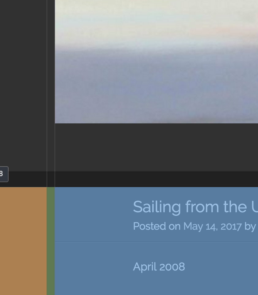
Do you think the Header image looks too soft focus now?
The header file is 1020×348 but is being stretched to fill an area that is 1600×546. Due to this, it won’t look as good as it does at the original size. You could try uploading a larger image to see how that works. As long as you aren’t stretching the original file, it should look better than the current image.
Is there something I can use to widen the actual post area?
Sure. Keep in mind that it will shift the layout of your posts. You can remove this or make the numbers smaller and that will give you more horizontal space for your posts:
/* Add padding to post and page content areas */

    .single .entry-content, .single .entry-header {
        padding-left: 175px;
        padding-right: 175px;
    }
The widget area looks too big now and I’ve taken the padding to 200px, but this doesn’t seem to make much difference. I’d like the right-side of the widget column to at least be in line with my Header’s image right-side (if that makes sense).
Sure, you can adjust the sidebar with this:
/* Adjust the width of the widget area */

.site-main .widget-area {
    width: 29.4%;
}
That is the default, but making it about 20% looked good to me.
Here is the default for the content area:
/* Adjust the width of the post content area */

.site-content {
    margin-right: 31.4%;
}
It looked good around 22%, but as always, adjust to your liking.
Also is it a better practice to use ems, pxs, or %?
Typically, we’re modifying dimensions that the theme developers have already set. In those instances, its best to keep the same unit of measure. For other things, it really depends on the context, but there are a number of articles out there on the topic if you’re interested.
Left and Right-aligned footers are not longer aligned but still in the same place as before. Looks odd.
Are you referring to this text? If so, let me know how you’d like to adjust it, and I can help.
Need the CSS to reduce the widget container if possible and would like the post’s left and the widget column’s right side inline with the Header image’s sides if possible?
I believe I’ve addressed this here in this reply, but let me know if any part of this isn’t addressed by the above CSS.
-
Many thanks for all your help!
I’ve changed the image but the theme only allows me to have 1500px width image – I re-loaded the image with its full width. Is it best to size the image exactly to 1600px then “Skip the cropping”? I think this one looks better than the stretched. Do you?
I can’t seem to make the lighter grey (post’s container) align with the Header’s left side, and the lighter grey (widget’s container) align with the Header’s right side. Do I need left and right padding for the margins?
Also, by adjusting the widget container’s percentage, this creates a fat margin between the post and widget columns, which looks a little ugly and disconnected, with the widget column’s right-side margin as just a slither.
Yes, the footer displays correctly on the Home page but not in the actual post pages.
-
Is it best to size the image exactly to 1600px then “Skip the cropping”? I think this one looks better than the stretched. Do you?
Skipping cropping would work, but it definitely looks better than it did before now.
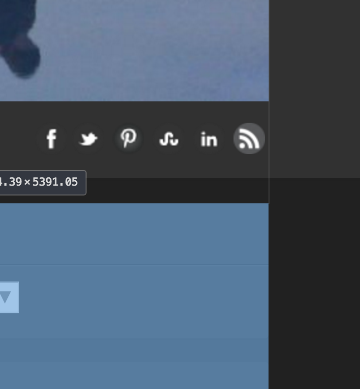
I can’t seem to make the lighter grey (post’s container) align with the Header’s left side
It looks like it is already lined up. The blue area at the bottom of this image is the post container:
the lighter grey (widget’s container) align with the Header’s right side
I see this lined up with the header as well:
Also, by adjusting the widget container’s percentage, this creates a fat margin between the post and widget columns, which looks a little ugly and disconnected, with the widget column’s right-side margin as just a slither.
Hmm, have you tried the widths I suggested earlier? They keep the space between the post and widgets smaller:
.site-main .widget-area {
    width: 20%;
}

.site-content {
    margin-right: 22%;
}
You can decrease the widget area width to make it more narrow, and decrease the site content margin to make it wider.
Yes, the footer displays correctly on the Home page but not in the actual post pages.
Sure, add this to correct that:
.site-info { max-width: 1600px; } -
1. Image OK now, thanks.
2. The left and right thumbnail images in Home are aligned with the Header image’s left and right sides. I’ve used:
.site-header .section,
.site-main {
max-width: 1600px;
margin-right: 2%;
margin-left:2%;
}
but the thumbnails still align with the Header image. I’d like to display the grey container the same as my post page in #3 following.3. Yes, but as you said originally, the post width is too long for readability. I’ve just added margin-right:1.3% and margin-left: 1.3%, and that’s aligned the grey container up to the Header image. Do you think it’s too hard for readability still? Thanks for your help!
4. Great, thanks, that worked.
Do you think my site looks OK now and I should stop messing around with it? :)
-
The left and right thumbnail images in Home are aligned with the Header image’s left and right sides….but the thumbnails still align with the Header image. I’d like to display the grey container the same as my post page in #3 following.
I noticed that the 2% right and left margins you’re using here are actually keeping the page from being centered. I recommend removing those unless you prefer how it looks now.
I’d like to try and clarify a bit what you are wanting to align. I have a few questions below, and it would be helpful if you could let me know your thoughts on each of them.
Home Page
1. Are you wanting the edge of the grey boxes to align with the edge of the header image above? Or do you want the edges of the post images to align with the edge of the header image?
Post View
What I see now is that the post area is more narrow, but the right edge of the widget area is no longer aligned with the edge of the header image above.
Do you think it’s too hard for readability still?
I would personally recommend that the text in the posts either be a little larger, or that the post area (not the grey box around the post) be a bit more narrow.
2. Do you want help to make the grey box for the post wider, but have the content inside the post stay about the same width as it is now? I can help you make the content narrower if you like.
3. Do you want help to make the right edge of the widget area line up with the right edge of the header image?
Do you think my site looks OK now and I should stop messing around with it? :)
Haha. I think once the site is centered again, and the images and grey boxes line up as you want it, you’ll be all set. :)
Let me know how I can help.
-
Hi again,
Thank you for the comprehensive solution! (As I always work on a laptop, this may be the difference for the display.)
I removed the 2% margins, so although centred now. It’s quite a bit wider though, what do you think?
Home Page
Yes, I’d like the edge of the grey boxes to align with the edge of the header image above, so it brings everything in a little. If it doesn’t look good I can always revert back. :)Post View
I like that the light grey is aligned directly beneath the Header image but agree that it’s too wide and harder to read. My font is the Default font for the theme. When I Inspect elements, it’s at 100% but not sure what size this is? What is the recommended font size for a blog is it about 16px?Cool, thanks for all your feedback and help! Until the next time I decide to change things on my blog site. Although, I haven’t got time as I’m building an eCommerce self-hosted WP site for my photography side and hope I get the same level of excellent help as I WP.com! :)
-
Maybe a Post’s entry-content text needs to have slightly thicker margins also or is this overkill?
-
Thank you for the comprehensive solution! (As I always work on a laptop, this may be the difference for the display.)
Happy to help. I’ve adjusted the width of my display to 1600px wide and it’s helping me see the issue with the home page alignment a bit better.
Home Page
Yes, I’d like the edge of the grey boxes to align with the edge of the header image above, so it brings everything in a little. If it doesn’t look good I can always revert back. :)Ok, I took another look, and I believe I have something that should resolve the issue:
@media screen and (min-width: 1281px) {
    .home .site-header .section, .home .site-main {
        max-width: 1540px;
    }
}

.masonry .hentry {
    width: 31.9%;
}
When I Inspect elements, it’s at 100% but not sure what size this is? What is the recommended font size for a blog is it about 16px?
Currently the font size for paragraphs equates to 14px. The experts I’ve seen have mentioned an ideal length of either 45-75 characters per line or 12 words per line. You can play with the font size for paragraphs in your posts by using the CSS below:
article p{
    font-size: 16px;
}
I removed the 2% margins, so although centred now. It’s quite a bit wider though, what do you think?
Including the minor changes above, I think it’s looking really good. :)
Maybe a Post’s entry-content text needs to have slightly thicker margins also or is this overkill?
I think it’s worth experimenting with.
You already have this code in your CSS area, but the values are currently set to 100px each:
@media screen and (min-width: 1281px) {
    .single .entry-content, .single .entry-header {
        padding-left: 175px;
        padding-right: 175px;
    }
}
Try that, or increase/decrease them to match what you feel fits best.
-
Thanks again!
1. Increasing the font to 16px doesn’t increase the list font so I’ve used the following (looks fixed now):
article p, ul li{
font-size: 16px;
}Is it better to use ems/rems in this instance? (Hope I’ve captured all font size throughout my site.)
2. Increasing the padding to 175px makes the post a skinny strip. I’ve played around with it and it’s 105px now.
3. The additional .masonry .hentry CSS reduced the Post’s grey box so it’s narrower than the Header image but only reduces the Home page grey box on the right-side. It’s also reduced the Widget container area quite a lot, so I’ve left this out.
Think I’ll leave it as is as I can’t seem to get a happy balance between the grey containers aligning with the Header image whilst reducing the content’s padding to suit.
Thanks again for your great help! :)
-
Using px values for the font size is just fine. :)
I’m glad I was able to help and that you’ve gotten it to a place of comfort.
I’ll go ahead and mark this thread as resolved, but if you need any further help, feel free to start a new thread.
-
Thank you!
Just noticed that by increasing the font, this also increased the font in my widgets area, which I’d like to keep smaller. For example, for my top posts links, increasing the font reduced the size of the thumbnail.
I’d prefer the thumbnail to be slightly larger and the font smaller, if that’s possible? -
Just noticed that by increasing the font, this also increased the font in my widgets area, which I’d like to keep smaller
Sure, so that’s because of the ul li that was added to the font size in item 1 above.
If you want to restrict that font size change to the articles, you can make the selector article ul li instead.
Let me know if that fixes things.
-
That worked but reduced the post font to a smaller size also, so I used this instead:
.widgets-list-layout li {
font-size: 14px;
}Can I increase the widget Today’s Reader Favourites thumbnails? DO I need to use .widgets-list-layout-blavatar ?
-
Forgot to add, since changing my site’s font size, the widget column displays different size fonts for the widget title and content. I’d like to make all the font size consistent (but smaller than the post font). For example, the Destinations widget font is the same size as the post size. I would like to drop it to 14px.
Many thanks.
- The topic ‘Visual: Reduce space around Header image and posts’ is closed to new replies.
 WordPress.com Forums