Why can I not create an image in the size provided for my blog ?
-
Using 2015, I’m trying to make an image for the vertical custom image. It’s difficult, as it has to be largely white in order not to under-run the text therein and make that illegible.
I create a stripe of ¼ the width of the 954 X 1300 recommended size and of the full length, and then widen the paper size to 1300, so that I end up with an image, saved as a .jpg, of the correct size.
And when I try to insert it, the ¼ coloured stripe disappears off the left edge: the image has been inserted at about 4X the size, so that there’s no room for the colours.
This happens with several other themes, too: inserting an image of the required size simply doesn’t work – it becomes distorted in size.
How is this meant to work, please ?The blog I need help with is: (visible only to logged in users)
-
Hi there,
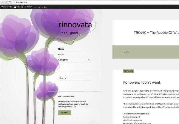
Please note that it is working as it should. It depends on your display size and your site is responsive. Currently I am seeing it at the full size when I use a large browser display size:
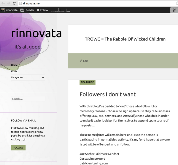
However, when I shrink by browser window it looks like this:
Cheers!
-
I am indeed grateful to you, Grace ! – thank you very much.
However …
This seems, to me, to pose a problem: is WordPress in the habit of offering themes in which headers can change depending on the width of the viewers’ monitors ?
How does a theme-chooser know this ?
What does one do to accommodate it ?
I had thought that those three little icons were all we need to ascertain the look of a theme in ordinary width, tablet and mobile. Now I realize there is no such thing as ordinary width, how do I ensure setting a sidebar that won’t change ? -
is WordPress in the habit of offering themes in which headers can change depending on the width of the viewers’ monitors ?
How does a theme-chooser know this ?Responsive design is currently where most of our themes are heading. I’m going to assume that the future of most of our themes will be responsive as the web in general is moving towards responsive design.
I believe the desire for the theme to be responsive is wanted by most users because viewing a site on a desktop, tablet, and mobile is a very different experience and responsive design tailors your site to the specific device.
However, if you don’t want this, you can filter for older themes that are not responsive. If you look at any theme support guides make sure it doesn’t say that it’s responsive as the ones with responsive design will say it in the support guide.
Here are a couple that may work:
http://theme.wordpress.com/themes/chateau/
http://theme.wordpress.com/themes/shine-on/
http://theme.wordpress.com/themes/imbalance2/If you want to still use this theme, and get rid of the responsive design, you would have to play with the Media Queries with CSS. Take a look at this guide for more information:
Let me know if you have any questions with this!
-
It’s not that I want an unresponsive theme, Grace; but until now – for me, that is – I hadn’t come across one that was not only responsive but more so than my monitor can handle. Or, should I say, a theme beyond my ability to envisage !
-
I hadn’t come across one that was not only responsive but more so than my monitor can handle.
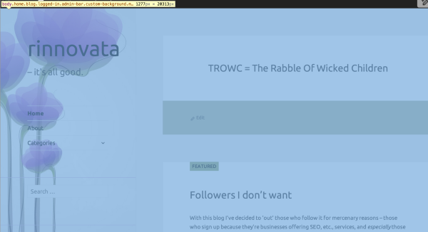
I see that your window/screen size is 1280px wide and at that size you should be seeing this:
If you want to make sure you see the entire left side of the flower at that window size you will have to add Media Queries via CSS. If you aren’t sure how to do that, you can repost this question to the CSS Customization forum here:
https://en.forums.wordpress.com/forum/css-customization
We have staff and volunteers there that would be better able to handle this type of support request!
-
Yes, I’ll talk to Rich.
Thank you re the Media Queries; and no, my monitor doesn’t show that much.
- The topic ‘Why can I not create an image in the size provided for my blog ?’ is closed to new replies.
 WordPress.com Forums