ClassicAddons Content Blocks

ClassicAddons Content Blocks for Gutenberg Editor brings premium quality elements to your WordPress site. Built with modern Gutenberg APIs, full PHP 8+ compatibility, and extensible architecture for upcoming block packs.
Currently includes:
- Classic Section — a full-width container/row with background (color / gradient / image / overlay) and an adjustable inner content max-width. Drop columns, info boxes or any blocks inside.
- Classic Hero Section — a fully customizable hero with pill, gradient heading, two CTAs, animated proof bar and a browser-mockup image.
- Classic Eyebrow — a small pill/label for section headers: alignment, optional link, icon, colors, background, border and typography.
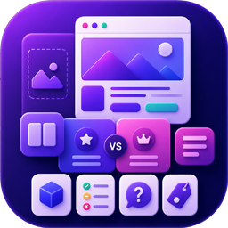
- Classic Versus Box — head-to-head two-card layout with optional „VS“ badge, custom item icons and ribbon badges. Composable: drop it inside a Classic Section with your own heading.
- Classic Comparison Table — feature-by-feature comparison with highlighted column, good/bad/meh status pills, optional in-card header and footnote. Composable.
- Classic Info Box — feature card with icon (dashicon / image / emoji / custom SVG), customizable title, description, optional link, and 5 style variations.
- Classic FAQ — accessible accordion (native details/summary) with optional FAQPage JSON-LD schema for SEO. Renders the list only — compose the heading with the Eyebrow / Heading / Paragraph blocks.
- Classic Pricing Box — a single pricing plan card (name, price, features, badge, featured style) with a flexible CTA — a link or a JS button with custom id, classes and data-attributes (works with Paddle.js and similar). Stretches to equal height; drop several into a Columns/Grid layout.
Highlights:
- Dynamic PHP rendering via render callback (lean, cached, secure).
- Full responsive controls (desktop / tablet / mobile) for typography, padding and visibility.
- SEO-friendly heading tag selectors (H1 through H6, div) and optional FAQ schema (JSON-LD).
- Block style variations for the Hero, Section, Versus, Comparison, Info Box and FAQ blocks.
- Reusable controls — typography, spacing, color, gradient, icon picker, responsive helper.
- WordPress Coding Standards, full escaping/sanitization, i18n-ready.
- Accessibility: semantic HTML, ARIA labels, reduced-motion support, keyboard-friendly controls.
- Editor-only assets separated from frontend assets — only loads on pages that use the block.
- Built with
@wordpress/scripts, ES Next, functional React components.
Source Code & Build Process
This plugin is fully open source (GPL-2.0-or-later). The complete, human-readable
source for every compiled asset is bundled inside the plugin in the /src
directory. The minified files in /build are generated from /src using the
official @wordpress/scripts toolchain (webpack under the hood) — no other build
tools are required.
To regenerate the compiled assets from source:
npm install— installs the build dependencies declared inpackage.json.npm run build— compiles/srcinto/build.
Use npm start for a watched development build. There is no obfuscation; the
build step only bundles and minifies the JavaScript and SCSS that ships in /src.