ShiftNav – Responsive Mobile Menu
·
Add a native-style, off-canvas, responsive mobile navigation menu to your site.
평가
버전
1.8.2
활성화된 설치 항목
10K
최근 업데이트일
Jul 31, 2025
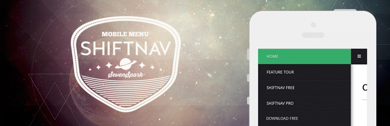
ShiftNav is an awesome mobile menu for WordPress. It looks and acts like native app off-canvas slide-out menus for popular apps like Facebook, Gmail, etc.
ShiftNav Demo – see how it works
Get started: ShiftNav Quick Setup Guide
Feature Overview
- Native App-Style Menus
- Automatic Integration
- Light & Dark Skins
- Works with the WordPress 3 Menu System
- Touch-enabled
- CSS3 Transitions produce smooth animations on mobile devices
- Configurable
Want to take your menu to the next level? Go Pro
Browser Compatibility
ShiftNav will open with a slide transition with browsers that support it. For browsers that don’t fully support CSS3 transforms, the menu will fall back to non-animated open/close functionality.