Aha Mobile Menu – Responsive Off-Canvas Mobile Menu & Hamburger Navigation
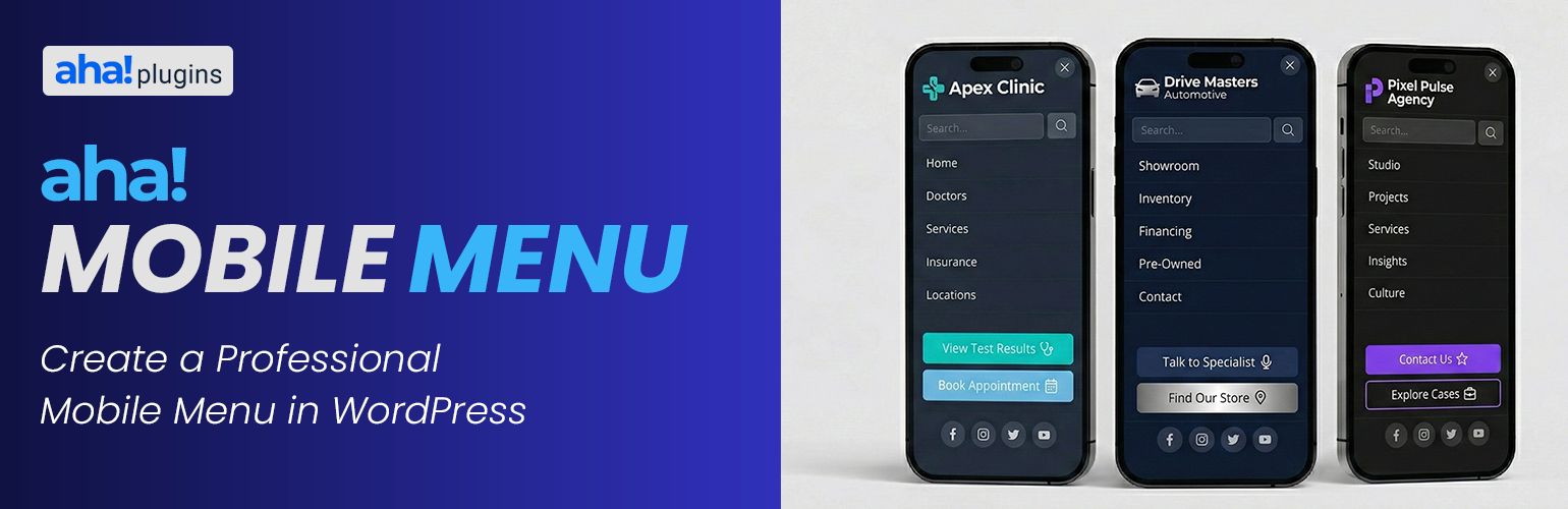
Lightweight mobile menu (off-canvas) for WordPress. Works on desktop too. Aha Mobile Menu adds a simple, fast, and customizable off-canvas menu to your site: it slides in from the left or right with slide or fade animation, and can be shown on mobile only or on desktop as well.
Product page | Documentation | Support | Pro add-on
Features:
- Enable/disable the menu and choose position (left or right)
- Slide or fade animation
- Optional: show only on mobile (viewport < 768px) or on all devices
- Logo at the top of the menu
- WordPress navigation menu selection
- Built-in search box
- Social links with automatic icons (Facebook, Instagram, Twitter/X, LinkedIn, YouTube, WhatsApp, and more)
- Color customization: background, text, close button, search, menu links, social icons
- Color palettes for quick styling (default, dark, light, purple, blue, green, etc.)
- Close on click outside and on navigation
- Configurable trigger: default class
aha-open-sidebaror custom CSS selectors - Page and post type exclusions so the menu is not loaded where you don’t need it
- Hooks for customization
- Uninstall tab: choose whether to remove plugin options from the database when the plugin is deleted from Plugins → Installed Plugins (not on deactivate alone). If you use Aha Mobile Menu Pro, the same preference applies when removing the Pro add-on’s license option.
Translations
The official language of the plugin is English. The following translations are included out of the box:
- Português do Brasil (pt_BR) — Brazilian Portuguese, complete translation included.
- Español (es_ES) — Spanish, complete translation included.
Want to translate the plugin into your language? You can contribute translations on translate.wordpress.org.
Demo, documentation & addons
Watch a demo, read the full documentation, and learn about available addons on the Aha Mobile Menu Product Page.
Video tutorial
Step-by-step setup: Aha Mobile Menu tutorial on YouTube.
Requirements
- Your theme must provide a button or element with the trigger class (e.g.
aha-open-sidebar) to open the menu. Add this class to your hamburger icon or menu toggle.
Discover more WordPress plugins: Visit Aha Plugins