Make Tables Responsive
·
Automatically makes the HTML tables in your posts and pages responsive (mobile-friendly).
评级
版本
1.8.0
活跃安装
6K
最后更新
Dec 4, 2025
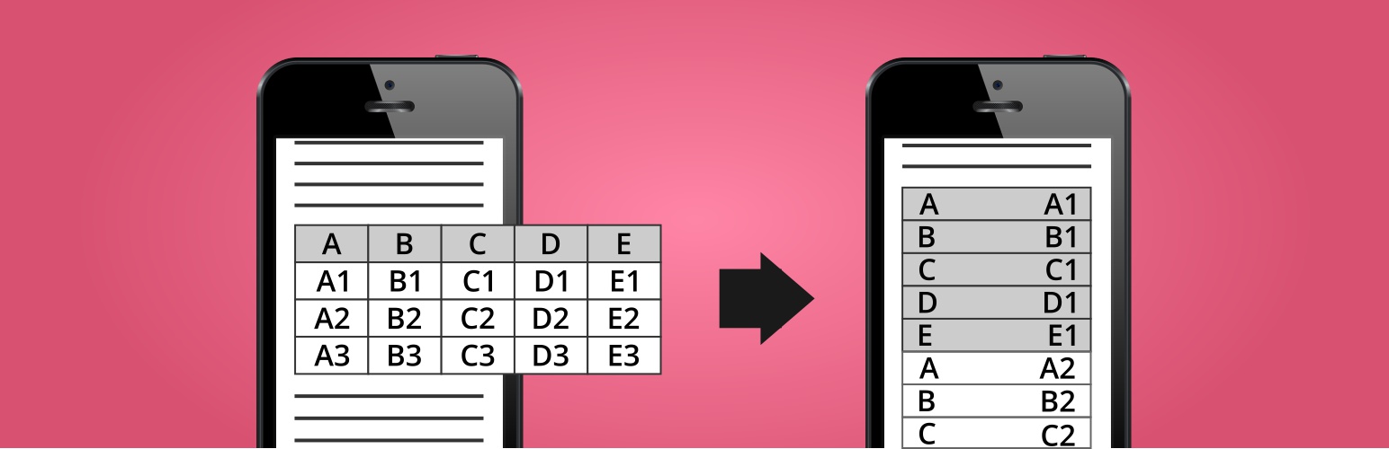
Automatically makes the HTML tables in your WordPress posts, pages, and widgets responsive (mobile-friendly). Devices with a small screen will see the tables in a new layout with two columns. In the first column will be the data from the first row (the column names), and in the second column will be the data from the other rows.
WordPress Plugin Demo
https://nikolaydev.com/demo-of-make-tables-responsive/
HTML and CSS Demo for Non-WordPress Sites
https://nikolaydev.com/make-tables-responsive-html-and-css-example/
Features
- Affect post/page content, excerpts, category descriptions, and text/HTML widgets
- Choose affected screen size
- Choose the cell background and border color for even and odd rows
- Disable for tables by HTML class or ID
- Disable or enable only for posts and pages by ID
Pros 🙂
- Fully automatic
- Does not change the actual post/page content in the database
- Easily reverse changes by deactivating the plugin
- No jQuery or JavaScript on the front-end
Cons 🙁
- The first row must contain the column names
- Skips tables with merged cells
- Skips posts/pages with tables inside tables
- Skips multi-row tables when only some columns use “th” tags
- In multi-row tables, HTML code is stripped from the cells with the column names, when displayed in the responsive version (as the left column)