Header resize CSS
-
Hello
When the site is viewed on a mobile device the header image does not fit the screen and expands. Is there CSS to correct this? Also on mobile one of the profile photos (Lizzy) is not aligned with the rest and appears higher however on PC it is completely fine. Any suggestions?
The blog I need help with is: (visible only to logged in users)
-
Hi, give this a try and see what you think. Make sure and view on phone and tablet if you can.
.site-header { height: 0; width: 100%; padding-top: 14.22%; background-size: auto 100%; position: relative; } .site-header .home-link { min-height: 100%; position: absolute; z-index: 10; top: 0; max-width: 100%; } -
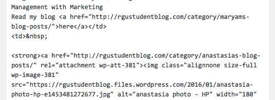
On the profile pictures, first off let’s add this to your CSS
td {
    vertical-align: top;
}
Next, open that page in the editor, switch to the Text tab and you will see this: https://cldup.com/2oKkSmGkzi.png
remove the blank lines and the non-breaking space code so it looks like this: https://cldup.com/1DiJFaiHzs.png -
Thanks. The header size has been corrected.
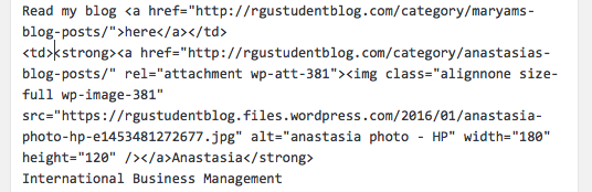
I added the css for he profile photo and removed the blank lines and non breaking space code however on mobile view the middle profile (Anastasia) has gone down. Is there a way to correct this? -
There was a non-breaking space at the beginning of the td for Anastasia. I removed it for you. See how things look now.
- The topic ‘Header resize CSS’ is closed to new replies.
 WordPress.com Forums