

The Grid block is a container for other blocks and a variation of the Group block. Use it to organize multiple blocks in a grid and control the color, text style, height, width, and position of everything inside the container.
In this guide
Have a question?
Ask our Support AssistantYou can start with a new, empty Grid block or group existing blocks into a grid.
To add a new Grid block, click the + block inserter button and search for “grid”. Click it to add the block to the post or page. Using your keyboard, you can also type /grid on a new line and press enter to quickly add a new Grid block.

For more information, visit our detailed instructions on adding blocks.
After adding a Grid block, click the + block inserter to start adding blocks inside the grid.
For blocks already on the page, you can combine them into a Grid block using the following steps:
- Select the blocks you wish to group together. You can select multiple blocks using one of these options:
- Clicking and highlighting the blocks with your mouse.
- Clicking the first block, then holding down the Shift key on your keyboard and clicking the final block to select all blocks between the first and last block.
- Using List View, click the first block, hold down the Shift key on your keyboard, and click the final block to select all blocks between the first and last block.
- In the block toolbar that appears above or below the blocks, click on the Grid icon to add the selected block into a new grid:
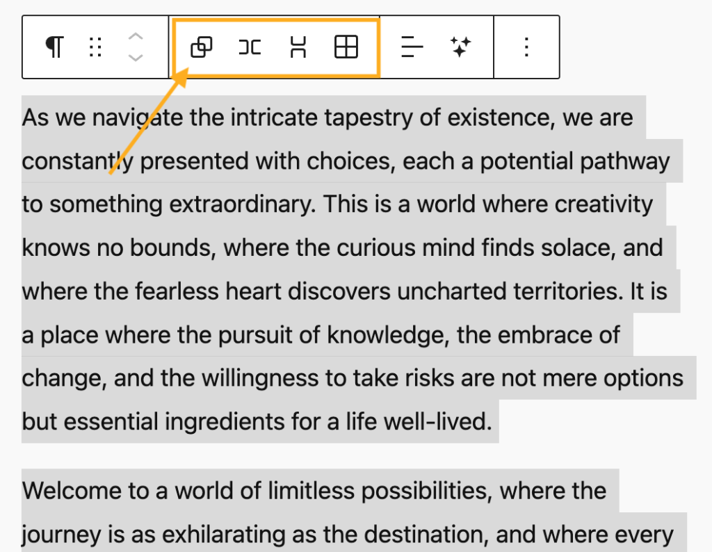
When you click on the block, a toolbar of options will appear:

The Grid block has the following options in the toolbar:
- Change block type or style.
- Drag the block.
- Move the block up or down.
- Change alignment: none, wide width, full width.
- More options.
When you select a block, you will find additional block settings in the right sidebar. If you do not see the sidebar, you may need to click the Settings icon in the top-right corner to bring up the settings. This icon looks like a square with two uneven columns:

The Grid block includes the following block settings:
The Grid block can be converted into a Group block, Row block, or Stack block.
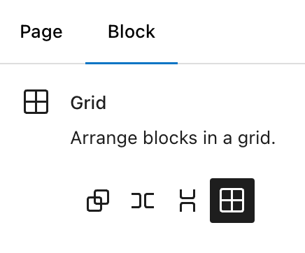
In the Layout settings, you can choose the number of columns in the Grid block by setting a minimum column width or by manually setting the maximum number of columns.
To stretch the columns so they fill the full width of the grid, turn on the “Fill available space” option. This option is hidden by default—click the three dots next to Layout in the block settings, then select “Fill available space” to show it and turn it on. When this option is off, the grid can leave empty gaps at the end of a row if there aren’t enough items to fill it.

Using the Position setting, you can choose between Default and Sticky:
- Default: When you scroll past the block, it will disappear as you move to other sections of the page.
- Sticky: The block will float and stay visible on the page, even when you scroll past the position where it was originally added. A pin icon will appear next to the block in List View.
Learn more about creating a sticky element.

For more information, visit our detailed instructions on Advanced Settings.
In the block settings sidebar, click on the Styles icon to access the design settings for the block. The Styles icon is in the shape of a circle, with half of the circle filled in:

Here, you can set the text color, background color, text size and fonts, padding, margin, and block spacing. See the following guides for more details on how to use these settings:
In the Grid block styles, as with all the Group block variants, you can set an image to display behind the block’s content. The Group block guide provides step-by-step instructions on adding a background image.
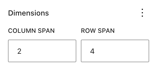
When you place an individual block like a Paragraph block inside a Grid block, you can define how many columns and rows this block should span. Adjust these dimensions for each block to create custom grid structures.
To edit the dimensions of a block inside a Grid block:
- Select the block within the Grid block whose dimensions you want to edit.
- Under Dimensions in that block’s settings sidebar, change the number of columns or rows the block spans.
You can also drag the handles of an element (like a paragraph block) to change the column and row span.
Below is an example of a Grid block with multiple Paragraph blocks set to varying column and row spans:
2 columns / 3 rows
3 columns / 2 rows
1 / 1
1 / 1
2 columns / 1 row
2 columns / 1 row
If you wish to remove a Grid block without erasing the inner blocks within, you can ungroup the blocks instead. Follow these steps:
- Select List View at the top of the editing screen.
- Select the Grid block.
- Click the three dots next to the Grid block.
- Select the Ungroup option.
